The Dashboard Delusion: When Engineering Metrics Measure Everything Except What Actually Matters
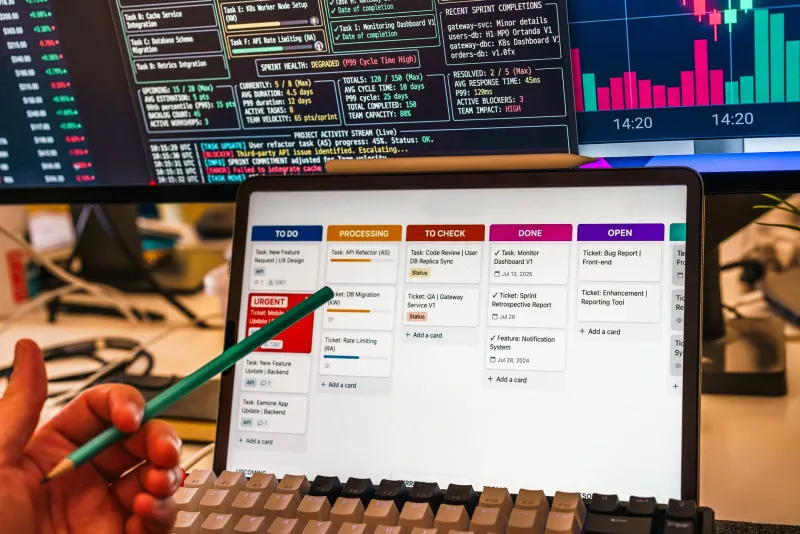
Walk into almost any engineering organization in the United States today and you will find dashboards. Dozens of them. Panels tracking deployments per week, API p95 response times, error rates by service, CPU utilization across every node in the cluster. The screens glow with activity. The numbers update in real time. The team feels informed.
And then a customer files a support ticket explaining that the core workflow they pay for has been broken for three days.
This is metrics theater—the organizational performance of measurement without the substance of understanding. It is one of the most expensive and underacknowledged failure modes in modern software organizations, and it is spreading as tooling makes it easier than ever to instrument everything while understanding nothing.
Why Vanity Metrics Feel Like Signal
The appeal of vanity metrics is not stupidity. It is cognitive ease. Deployment frequency, for example, is a clean, unambiguous number. It goes up when the team ships more often, and the DORA research has established that high-performing engineering organizations deploy frequently. So teams begin tracking it, celebrating increases, and optimizing for it—without asking the more important question: what are we deploying, and is it working?
A team that ships fifteen deployments a week of features that silently degrade user retention is not performing well. It is performing the appearance of performance. The metric is real. The insight is absent.
The same dynamic applies to API response time monitoring. P95 and P99 latency figures for internal service calls are genuinely useful signals—for infrastructure teams debugging service mesh issues. They are far less useful as proxies for what users actually experience. A service can respond to a request in 80 milliseconds while the user-facing action that triggered it takes four seconds, because the latency is accumulating across client-side rendering, third-party script execution, and network round trips that your backend monitoring never sees.
Measuring the part of the system you instrument most easily is not the same as measuring the part of the system that matters most to customers.
The Reliability Regression Blind Spot
Perhaps the most consequential gap in most engineering dashboards is the failure to track reliability regressions over time. Teams measure error rates at a point in time—the current error rate is 0.3%, which is below the 1% threshold, so everything is fine. What they rarely measure is the trajectory: was it 0.1% last quarter? Has it been climbing steadily for six months?
A slowly increasing error rate that stays below an alert threshold is not a stable system. It is a system trending toward failure. But because no alert fires, no one investigates, and the gradual degradation becomes normalized until it crosses a threshold that triggers a reactive scramble.
Deployment frequency metrics compound this problem. A team that ships frequently but lacks robust rollback instrumentation and regression tracking will accumulate small reliability regressions across dozens of releases, none of which individually trigger an incident—but which collectively erode the product experience in ways that surface in churn data months later.
Building a Metrics Framework That Reflects Reality
The solution is not to instrument less. It is to instrument with intentionality, starting from the user experience and working backward to the infrastructure, rather than the reverse.
Start with user-facing outcomes, not system-facing activity. Define the two or three actions that represent core value delivery for your product—the actions that, if broken, would cause customers to stop using the product or demand refunds. Instrument those actions end-to-end, from the moment the user initiates them to the moment the result is delivered. Track success rate, latency as experienced by the client, and failure mode distribution. These are your tier-one metrics. Everything else is context.
Distinguish between leading and lagging indicators. Error rates and uptime are lagging indicators—they tell you what has already happened. Leading indicators tell you what is likely to happen. Queue depth growth, database connection pool saturation, and memory pressure trends are leading indicators. A monitoring framework that surfaces leading indicators before thresholds are breached gives engineering teams time to respond before customers are affected.
Implement error budget accounting, not just error rate monitoring. An error rate of 0.5% means something very different for a service that processes one thousand requests per day versus one that processes ten million. Error budgets—derived from SLO commitments—translate error rates into concrete business impact: how many user sessions were degraded, how many transactions failed, how much of the reliability commitment has been consumed this month. This framing makes performance conversations legible to product and business stakeholders, not just engineers.
Track synthetic user journeys in production. Synthetic monitoring—automated scripts that execute core user flows against the production environment on a continuous schedule—catches failures that real-user monitoring misses during low-traffic periods. A checkout flow that breaks at 3 a.m. on a Tuesday may not generate enough real user errors to trigger an alert, but a synthetic monitor will catch it within minutes.
The Organizational Dimension
Metrics theater is not only a tooling problem. It is a cultural one. Teams optimize for the metrics they are evaluated on, and engineering organizations that celebrate deployment frequency without pairing it with reliability accountability will get exactly what they measure: fast shipping and fragile systems.
Leadership plays a critical role in shaping which metrics carry weight. When sprint reviews celebrate velocity without reviewing incident counts, when roadmap discussions reference feature throughput without examining SLO performance, and when postmortems focus on resolution time without examining detection time, the implicit message is clear: activity is valued over outcomes.
Restructuring that dynamic requires explicit prioritization. Engineering leaders who want to move from metrics theater to genuine observability need to establish which metrics are reviewed in which forums, who owns each metric, and what the response protocol is when a metric moves in the wrong direction.
What Good Monitoring Actually Looks Like
A well-instrumented engineering organization in 2025 maintains a clear hierarchy of monitoring concerns. At the top are user-facing SLOs—availability and latency commitments for core product flows, tracked against error budgets and reviewed weekly. Beneath those are service-level indicators for the infrastructure supporting those flows, with leading-indicator alerts calibrated to catch degradation before it reaches the user layer. Below that is the operational telemetry—logs, traces, resource utilization—that engineers use for debugging and root cause analysis.
Every metric on every dashboard should have a clear answer to two questions: what decision does this metric inform, and who is responsible for acting on it? Metrics that cannot answer both questions are noise. Beautiful, real-time, professionally visualized noise.
The goal of observability is not to see everything. It is to see the right things clearly enough to act before your customers notice the problem. That requires discipline, not just instrumentation.